18年再回首,20句话品味《别让我思考》【UXRen译#218】
作者: Steve Krug | 翻译:阿蚊子 审校:Perry阿力
设计,跟其他很多领域一样,是建立在伟大的专业人士的付出和发现上。每一个想要在他们专业领域上成为专家的人,常常会去寻找法则来学习怎样把事情做正确。由大师所写的各种各样的文章现在通过互联网都可以自由获取, 因此,那些努力学习的人可以毫不费力地就找到基本的指导。
我们常常分享来自Tubik博客上那些数字设计领域最优秀专家的的名言和睿智的想法。你可以从麦克·蒙泰罗(Mike Monteiro)写的《设计是一份工作》,由Aarron Walter写的 《情感化设计》,还有由印刷大师埃里克·斯皮克尔曼(Erik Spiekermann)推出的一系列的智慧思想中找到简短的见解。
我们继续引用来自Tubik工作室的收藏,下面是来自著名的书“Donn’t Make Me Think”的作者Steve Krug的最新引言。
2000年,第一次出版,在2014年,重新出版,《Donn’t Make Me Think》在今天依然紧贴时代的发展和符合实际的需要。Steve Krug 为交互设计定下了基本的可用性交互原则, 并在书中分享了自己在专业领域的实际工作经验,使得出版的书籍成为交互设计师首推的书之一。
“Donn’t Make Me Think”描述了那些对网页可用性设计重要的原则,案例和观点。它主要的想法是设计出那些用户不需要在交互设计上做过多思考的界面,这样的设计不仅仅能解决问题并且很容易使用。 下面20句话, 反应了“Donn’t Make Me think ”中关键的点。
1、如果有些事情看起来需要花费很多时间研究——或者它看起来是这样,它很可能就不会被使用。
If something requires a large investment of time—or looks like it will—it’s less likely to be used.
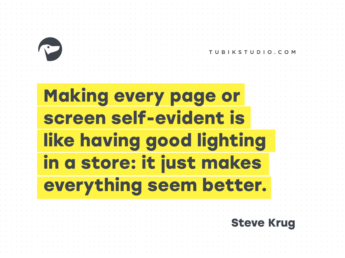
2、让网站每一页或每一屏都不言自明,就像在商店里有好的照明:它会让一切看起来更好。
Making every page or screen self-evident is like having good lighting in a store: it just makes everything seem better.
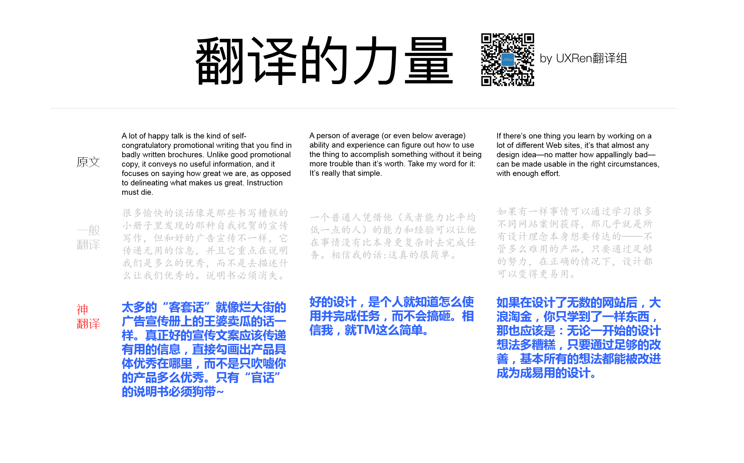
3、太多的“客套话”就像烂大街的广告宣传册上的王婆卖瓜的话一样。真正好的宣传文案应该传递有用的信息,直接勾画出产品具体优秀在哪里,而不是只吹嘘你的产品多么优秀。只有“官话”的说明书必须狗带~
A lot of happy talk is the kind of self-congratulatory promotional writing that you find in badly written brochures. Unlike good promotional copy, it conveys no useful information, and it focuses on saying how great we are, as opposed to delineating what makes us great. Instruction must die.
4、确保可达性是我们要做的争取的事情。而且不仅仅是应该去做,它是非常正确的事情,因为如果可达性没有引起足够的重视,你就无法意识到它能让某些人的生活有多大程度上变得更好。仅仅通过改善我们的工作,就有很大机会显著改善人们的生活,这难道还不够牛逼么?
Accessibility is the right thing to do. And not just the right thing; it’s profoundly the right thing to do, because the one argument for accessibility that doesn’t get made nearly often enough is how extraordinarily better it makes some people’s lives. How many opportunities do we have to dramatically improve people’s lives just by doing our job a little better?
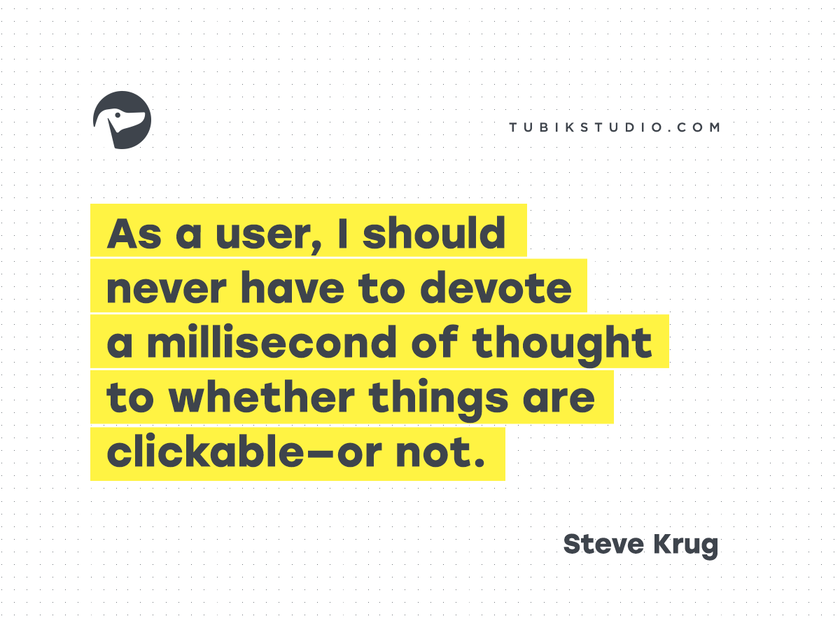
5、另外一个 让人们层出不穷的困惑是那些链接和按钮没有看起来是能点击的。作为一个用户,我应该不需要花费丝毫时间在考虑“按钮是否可以点击”这件事上。
Another needless source of question marks over people’s heads is links and buttons that aren’t obviously clickable. As a user, I should never have to devote a millisecond of thought to whether things are clickable—or not.
6、在最近几年,让一切事物变得更易用,几乎成为了每个人的责任。视觉设计师和开发者现在会发现自己是在做交互设计(决定下一步发生什么,当用户点击,轻击或滑动)和组织信息架构(理解一切是被怎么组织发生的)。
In the last few years, making things more usable has become almost everybody’s responsibility. Visual designers and developers now often find themselves doing things like interaction design (deciding what happens next when the user clicks, taps, or swipes) and information architecture (figuring out how everything should be organized).
7、好的设计,是个人就知道怎么使用并完成任务,而不会搞砸。相信我,就TM这么简单。
A person of average (or even below average) ability and experience can figure out how to use the thing to accomplish something without it being more trouble than it’s worth. Take my word for it: It’s really that simple.
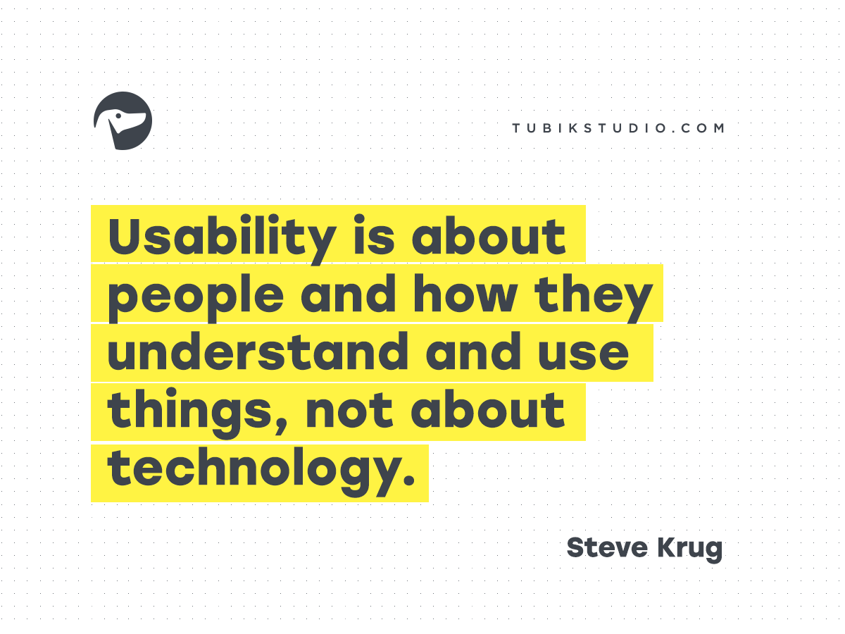
8、可用性是关于人们和他们怎么理解和使用物品,与技术无关。
Usability is about people and how they understand and use things, not about technology.
9、关于使用说明,你要知道,在人们反复尝试却总是失败后,才会去阅读它。
The main thing you need to know about instructions is that no one is going to read them—at least not until after repeated attempts at “muddling through” have failed.
10、在你认真观察、聆听更多用户清楚表达他们的意图、动机和思考过程后,你会发现:他们每个人在网页的操作行为,是基于多种影响因素的。尝试用“喜欢或不喜欢”这样的单一维度去描述用户,都是徒劳的,而且往往适得其反。好的设计,与它相反,应该是将复杂性考虑在内的。
The more you watch users carefully and listen to them articulate their intentions, motivations, and thought processes, the more you realize that their individual reactions to Web pages are based on so many variables that attempts to describe users in terms of one-dimensional likes and dislikes are futile and counter-productive. Good design, on the other hand, takes this complexity into account.
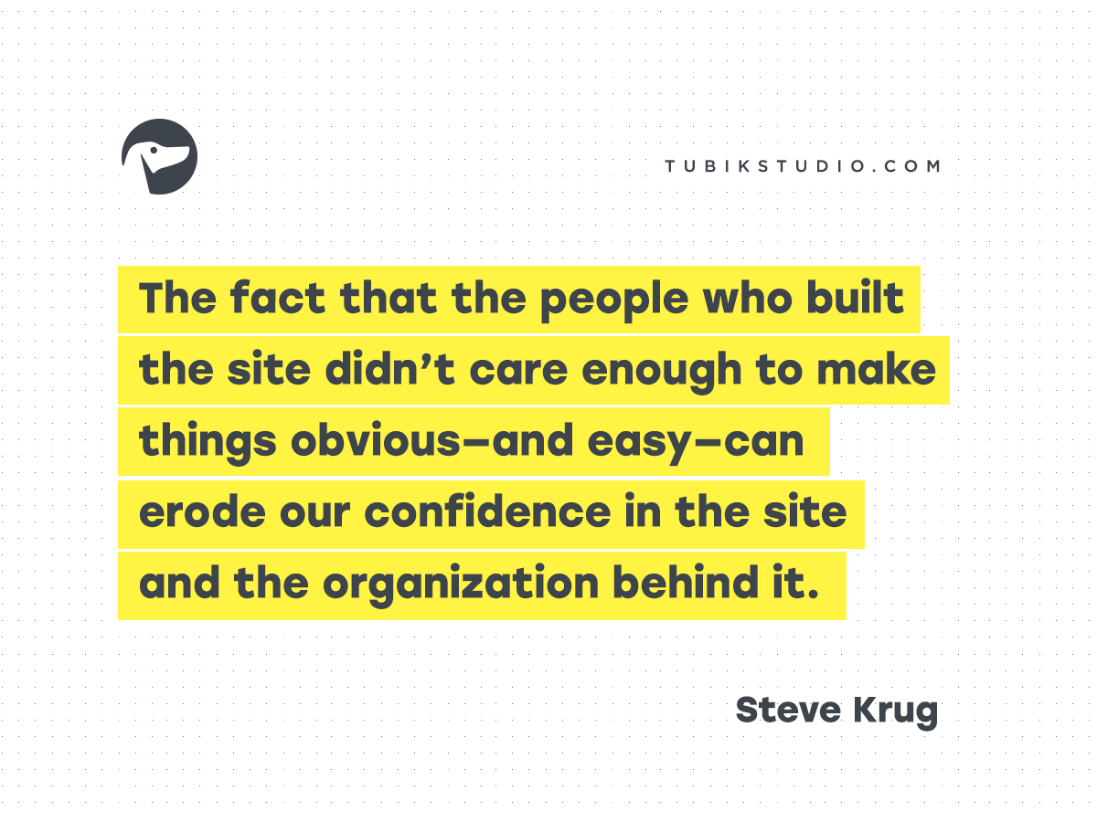
11、那些设计网站的人并不在乎让事情看起来更具有可见性和简单,使这导致用户对网站和背后的组织丧失信心。
The fact that the people who built the site didn’t care enough to make things obvious—and easy—can erode our confidence in the site and the organization behind it.
12、虽然现实中的大部分时间,我们无法选择最佳方案,但我们可以选择第一个最合理的选择,即所谓的“满意”策略。
In reality, though, most of the time we don’t choose the best option—we choose the first reasonable option, a strategy known as satisficing.
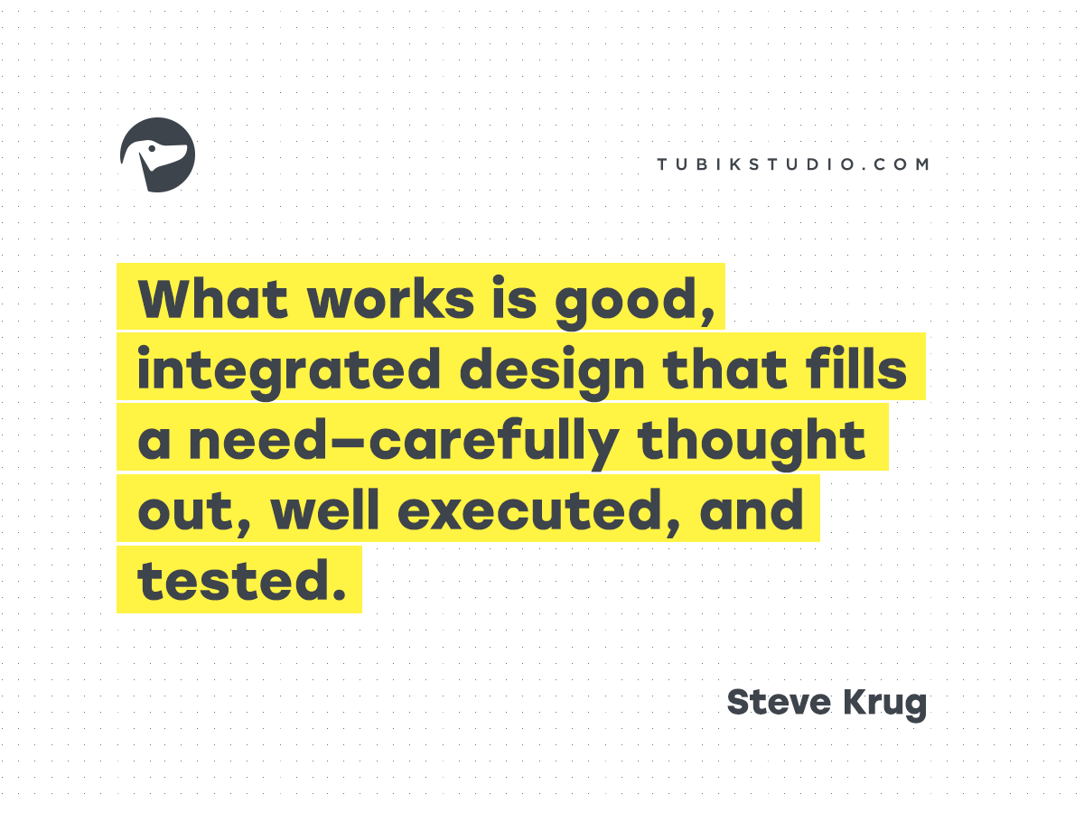
13、问题是,在大部分的网页设计问题上,没有简单的对错,至少对于那些重要的设计是这样的。什么的设计才是好的,就是经过一个完整设计过程,它包括仔细需求分析,然后实施,然后测试。
The problem is there are no simple “right” answers for most Web design questions (at least not for the important ones). What works is good, integrated design that fills a need—carefully thought out, well executed, and tested.
14、将页面上的文字内容删除一半,然后把剩下一半也删了。
Get rid of half the words on each page, then get rid of half of what’s left.
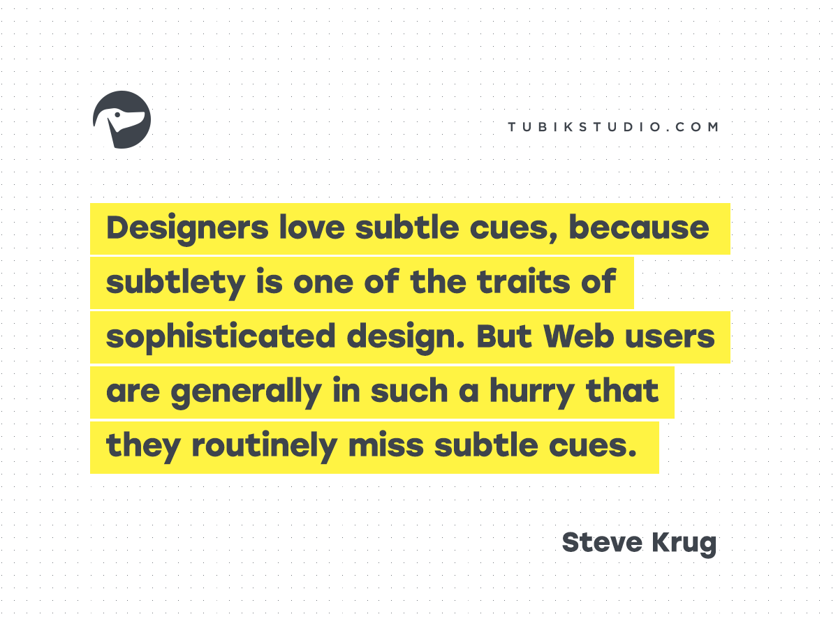
15、设计师喜欢埋下微妙的线索,因为线索是精细的设计特点之一。但是网站的用户一般很匆忙,以至于他们一向错过了这些微妙的线索。
Designers love subtle cues, because subtlety is one of the traits of sophisticated design. But Web users are generally in such a hurry that they routinely miss subtle cues.
16、如果在设计了无数的网站后,大浪淘金,你只学到了一样东西,那也应该是:无论一开始的设计想法多糟糕,只要通过足够的改善,基本所有的想法都能被改进成为成易用的设计。
If there’s one thing you learn by working on a lot of different Web sites, it’s that almost any design idea—no matter how appallingly bad—can be made usable in the right circumstances, with enough effort.
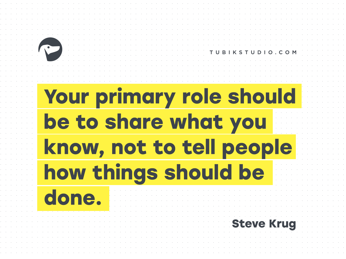
17、你主要的的职责应该是分享你知道的东西,而不是告诉用户怎么去把事情完成。
Your primary role should be to share what you know, not to tell people how things should be done.
18、你的目标应该是要完全删掉说明手册,通过设计将一切变得更不解自明,或者尽可能接近这样。当说明书是绝对必须的时候,那就尽量简洁。
Your objective should always be to eliminate instructions entirely by making everything self-explanatory, or as close to it as possible. When instructions are absolutely necessary, cut them back to a bare minimum.
19、面对追随旧的设计,对于设计师来说,去重复建造轮子反而是一个抵挡不住的诱惑,很大程度上是因为他们觉得自己被雇佣是因为要去做一些新的和不同的事情,而不是旧的东西。更不要说,现实中那些来自同龄人的赞美、奖赏和广受关注的工作机会基本不是来自很旧的设计。有时,那些花在重复发明轮子的时候导致了新的革命。但是往往,它也只不过花费了重新发明轮子的时间而已。
Faced with the prospect of following a convention, there’s a great temptation for designers to try reinventing the wheel instead, largely because they feel (not incorrectly) that they’ve been hired to do something new and different, not the same old thing. Not to mention the fact that praise from peers, awards, and high-profile job offers are rarely based on criteria like “best use of conventions.” Occasionally, time spent reinventing the wheel results in a revolutionary new rolling device. But usually it just amounts to time spent reinventing the wheel.
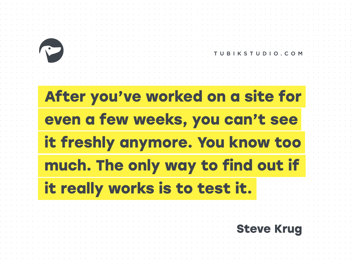
20、如果你想要设计一个很棒的网站,你需要去测试这个网站。在你使用网站超过几个星期后,你看不到任何的新的东西。因为你知道的足够多了。只有通过真正的测试,你才可能发现问题。
If you want a great site, you’ve got to test. After you’ve worked on a site for even a few weeks, you can’t see it freshly anymore. You know too much. The only way to find out if it really works is to test it.
彩蛋来袭,在这篇文章的翻译中间,让我们鉴证了UXRen翻译组群策群力的力量:
你以为我们在翻译文章,其实我们是在理解不一样的文化
更多译文:
为什么用户研究对初创公司很重要?
对话框上的微文案:取消、确认还是毁灭?
瀑布流,到敏捷开发,到设计思维,最后到精益创新
用户角色失灵?你一定是犯了这4个错误
案例回顾:重塑宜家官网的电商体验
全部200+篇译文>>
申请加入UXRen翻译组>>

译者:阿蚊子 审校:Perry阿力
作者:Steve Krug
原文标题:《Don’t Make Me Think: 20 Thoughts on Usability by Steve Krug.》
原文链接:https://tubikstudio.com/dont-make-me-think-20-thoughts-on-usability-by-steve-krug/
发布日期:暂无
版权声明:
- 本文版权归:UXRen翻译组 所有;
- 微信公众号转载说明:
1)由于近期微信审理严格,若是该文章未在UXRen公众号上首发,请不要转载;
2)公众号转载时,请在文章底部贴上UXRen公众号二维码。 - 网站转载说明:
1)文章标题必须保留“UXRen译”字样;
2)转载文中必须保留:“UXRen翻译组”、“作者”、“译者”及“审校者”信息;
3)转载文末必须保留本译文网页链接地址; - 如未遵照上述规则转载,视为侵权,UXRen社区保留随时追责的权利。
碎片化的时代,60%的使用群体都只喜欢使用某个软件的其中一部分功能。那些更多的体验更多的是针对专家用户使用的不是吗?
节后买了uxren出的《设计师要懂沟通术》,能明显感觉出后半本的翻译水平就是图里的「一般翻译」
Get rid of half the words on each page, then get rid of half of what’s left.
将页面上的文字内容删除一半,然后把剩下一半也删了。
这句话翻译错误